RED BULL JOYRIDE 2016 TRACK EXPLANATION
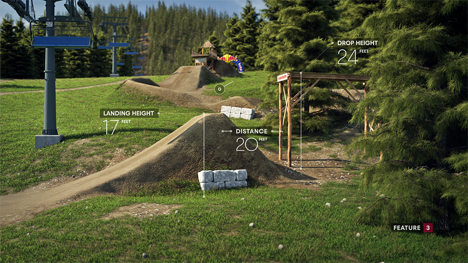
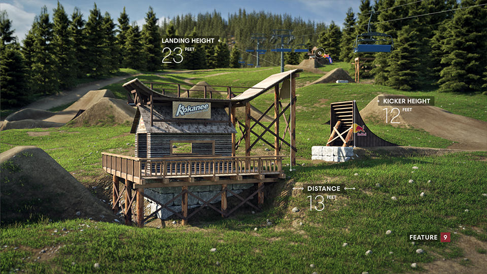
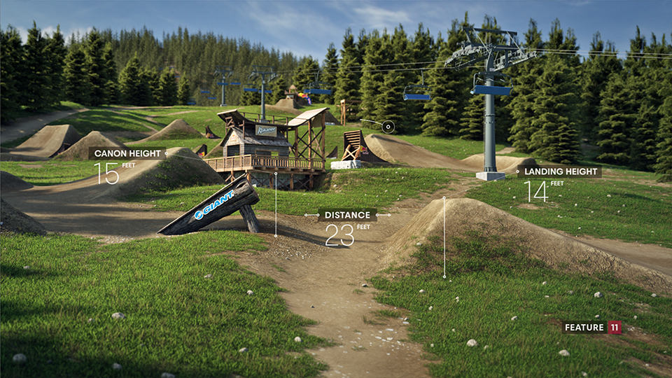
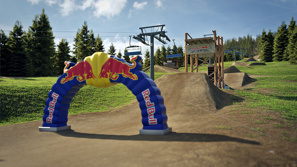
In 4 weeks I had to accomplish several tasks. This track explanation consists of designing the look and feel of the 3d environment, which had to be as close to real one as possible. Then I had to develop infographic's logic and design. The hardest part was to model and layout everything according to real measurements of the track , which was built parallel to the 3d one. The real track in Whistler was designed by Paddy Kaye, with who we worked closely to get the best overview and idea about the track.
In this case, I approached every problem seriously. Everything I had to "hack" in the previous case, which was Crankworks Les Gets, due to lack of skills and time, was done properly this time. The whole track consists of 6 4K textures prepared in Substance painter combined with procedural textures in less focused areas. Some wood elements I sculpted in Z-Brush and painted in Substance Painter. For grass and trees layout I patiently painted masks in Photoshop paying attention to keeping the look natural. All vegetation was scattered with Octane Scatter and the final animation was rendered on 6 Titan graphic cards within 4 days in Octane Render.
Client: Red Bull
Art Direction / Design / Execution: Miki Nemcek
Project management: Lenka Muchova
In this case, I approached every problem seriously. Everything I had to "hack" in the previous case, which was Crankworks Les Gets, due to lack of skills and time, was done properly this time. The whole track consists of 6 4K textures prepared in Substance painter combined with procedural textures in less focused areas. Some wood elements I sculpted in Z-Brush and painted in Substance Painter. For grass and trees layout I patiently painted masks in Photoshop paying attention to keeping the look natural. All vegetation was scattered with Octane Scatter and the final animation was rendered on 6 Titan graphic cards within 4 days in Octane Render.
Joyride Track Explanation 2016 animation won Silver at PromaxBDA 2017 in Infographics category! It is now an official design and source file template in Redbull Mediahouse for every Crankworx race.
Client: Red Bull
Art Direction / Design / Execution: Miki Nemcek
Project management: Lenka Muchova
SCREEN GRABS


CRANKWORX LES GETS 2016 TRACK EXPLANATION
This was the first approach of the track explanation animations in 2016 Crankworx season. I made this animation two months before Joyride and it helped me to learn a lot so I could push Joyride animation much further.
Client: Crankworx / Red Bull
Art Direction / Design / Execution: Miki Nemcek
Project management: Lenka Muchova
Client: Crankworx / Red Bull
Art Direction / Design / Execution: Miki Nemcek
Project management: Lenka Muchova
LEAVE A COMMENT
